Community & Awareness Design
Dog Beach Campaign
Building a Unified Voice Through Community Design
The Dog Beach Campaign was a rapid-response awareness initiative rooted in civic concern, strategic design, and community collaboration. Sparked by a sudden bylaw decision to eliminate Innisfil’s only designated lakefront dog beach—with no alternate access planned for several years—the campaign quickly evolved into a united grassroots movement.
In just under a week, I partnered with local advocate Melissa to develop and lead the visual direction of the campaign. From printed posters and digital graphics to QR-coded petitions and social-ready visuals, every element was created to clearly communicate the issue, guide public action, and maintain a calm yet urgent tone.
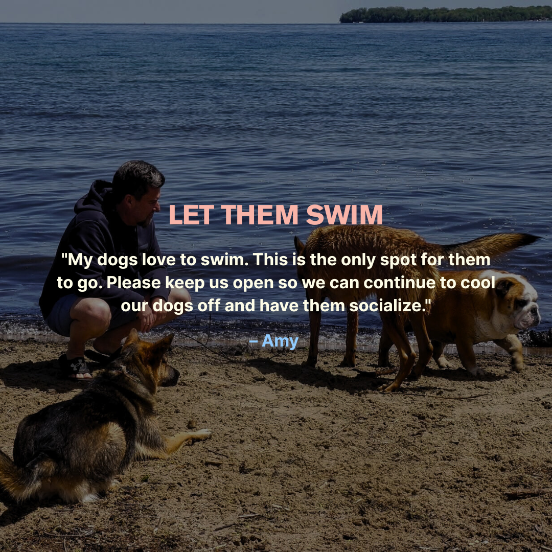
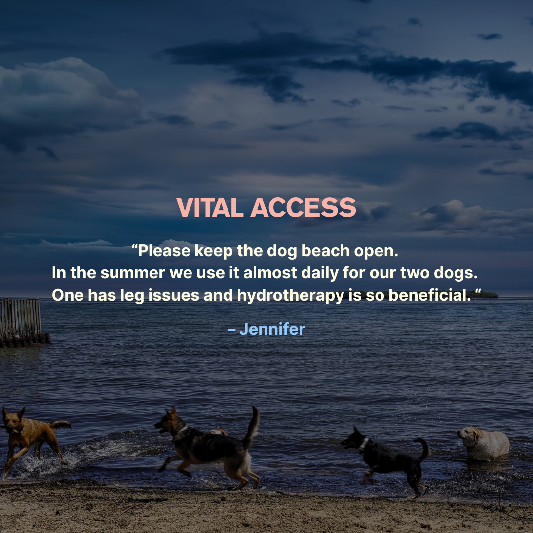
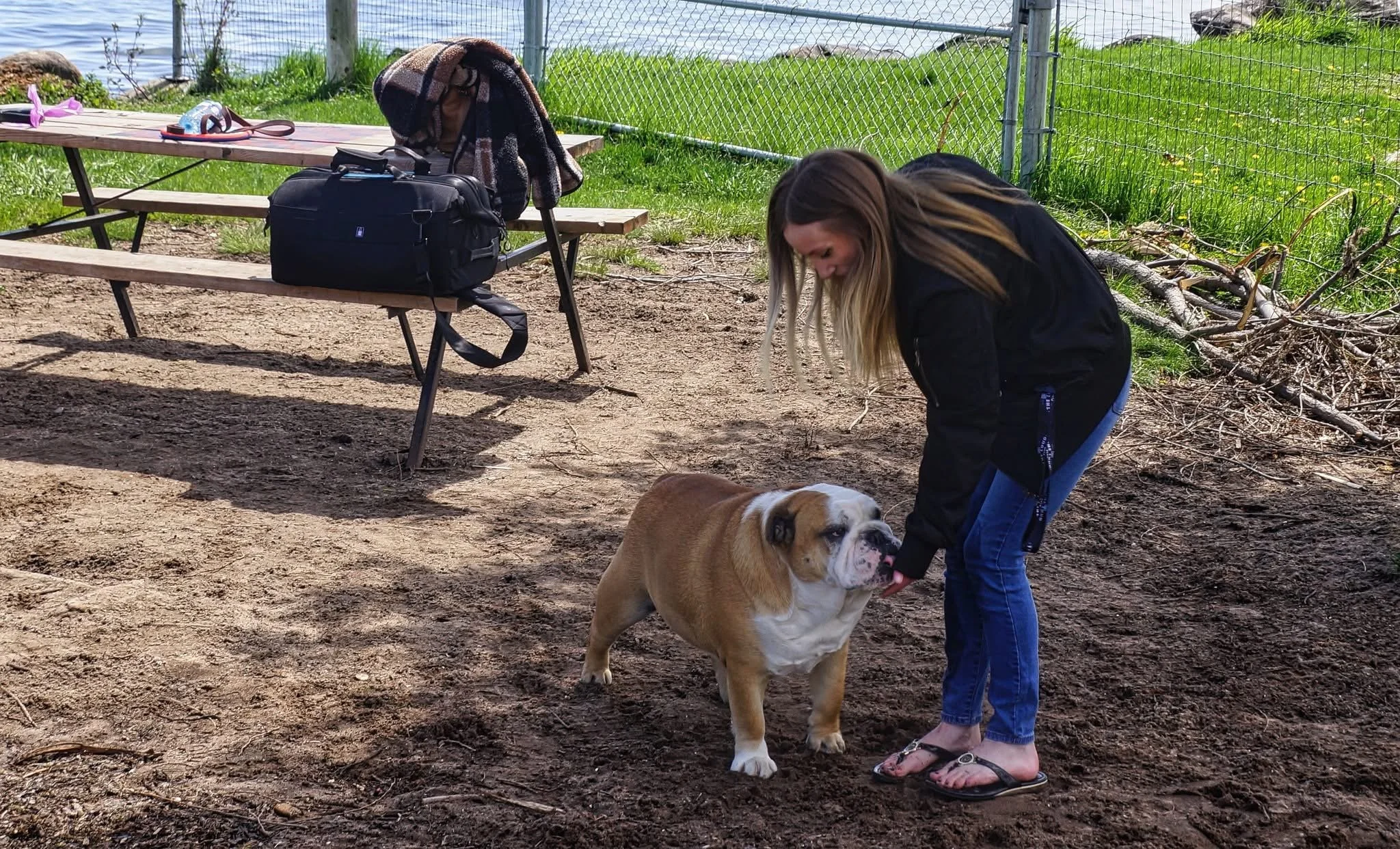
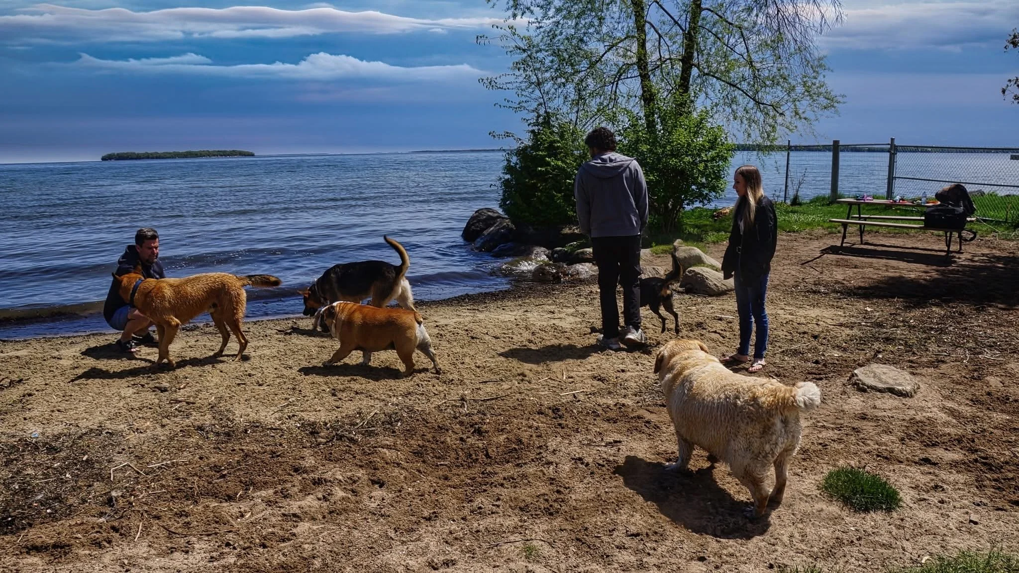
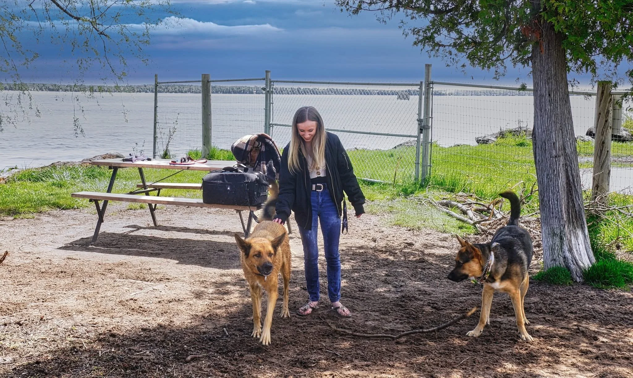
As a dog owner myself, this campaign held personal meaning. My German Shepherd, Jagger, became fast friends with Wilbur—the bulldog at the heart of this movement—and we were both proud to stand alongside so many others who care deeply about this space. Being part of this initiative wasn’t just a professional opportunity—it was a chance to protect something that genuinely matters to our daily lives and our community.
What started as a single Facebook post quickly grew into a community-wide call to action. The campaign generated over 1,450 likes across multiple posts, garnered coverage from CTV News Barrie, and culminated in a powerful moment of civic engagement: Melissa’s speech at the Town Council meeting and a unanimous vote to preserve dog access at the waterfront until a new beach with lake access could be prepared.
This project demonstrates how intentional, well-executed design can help shape public awareness, empower collective voices, and contribute meaningfully to real-world outcomes.
-
This campaign required a fast, adaptable design approach across both print and digital platforms. With limited time before the next Council meeting, I focused on creating visually cohesive, action-oriented materials to drive awareness.
I designed a set of awareness posters featuring a prominent QR code linking to a Google Form petition. These were optimized for both print and social media, making it easy to share and engage across platforms.
To support in-person efforts, we printed and posted the designs around the community, giving residents the option to sign either the digital or physical petition. Melissa also created a handwritten-style sign at the beach to boost visibility. Together, these materials built momentum quickly and kept the messaging consistent across all channels.
On May 14, Melissa delivered a speech during the Town of Innisfil Council Meeting’s open forum, which can be viewed at the 2:40 mark here. Our visual materials helped frame the issue and contributed to strong public turnout.
The campaign was later picked up by CTV News Barrie, leading to a 6:00 PM news segment and a published article:
- Watch the news clip
- Read the article
I also worked directly with the journalist, sharing visuals and background information to support the story and ensure accurate coverage. -
The campaign was created for Innisfil residents—particularly dog owners and community members impacted by the sudden removal of lakefront access.
Our goal was to make the issue easy to understand and act on, regardless of age or tech familiarity. By combining printed materials with digital tools like QR codes and social posts, the campaign remained accessible to both in-person visitors at the beach and active members of local Facebook groups.
The tone was intentionally calm, clear, and non-confrontational—designed to encourage respectful civic engagement while building a unified voice around a shared community space.
-
The design focused on clarity, accessibility, and calm urgency. With emotions running high, it was important that the visuals felt grounded and solution-oriented—encouraging engagement without creating panic or division.
Typography was clean and easy to read at a glance, even from a distance on printed posters. Layouts were structured to prioritize key information first, with short, digestible copy and high-contrast headings. The QR code was a central feature in every design, serving as the bridge between physical signage and digital action.
All assets were built with speed and flexibility in mind—sized for both print and digital formats, and visually aligned to maintain a consistent tone across platforms. The result was a set of cohesive materials that helped unify the campaign’s message and guide public response.